
My favorite Kraftwerk records remain Autobahn, Trans-Europe Express, and The Man Machine. There is a European utilitarian feel to the latter two, but they soon moved on to embrace the futuristic theme that many other bands of the time would also attempt. Some of the group's work into the 80's and beyond became unbearable (the popular competitive sound of other cringe-worthy 80's groups could take the blame for this too). Following some mediocre Kraftwerk releases came the expected remixing and repackaging of their mid-period hits.
My friend recently pointed out the new cover art on the most recent [2009] pressing of Trans-Europe Express. I'm sure there is an explanation for the decision to put out a version of the album that looks like this, but I think it's pretty bad. Is this just an unsuccessful minimalist piece by former Kraftwerker/group artist Emil Schult, or a modern-day outsider's interpretation of the epic album? It just plain lacks - Not just the new school image of the TEE, but the separation of the double line Title/Artist found on almost all previous versions. Most notably, the division of "Trans-Europe Express" and "Kraftwerk" found in the updated cover's layout seems eerily symbolic.
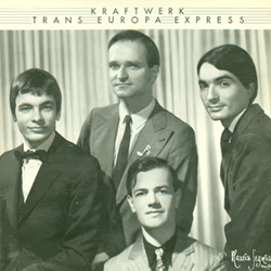
Capitol UK LP [1977]
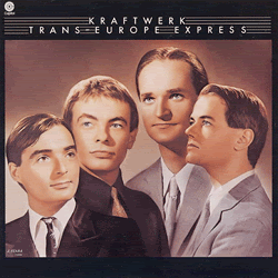
Capitol US LP [1977]
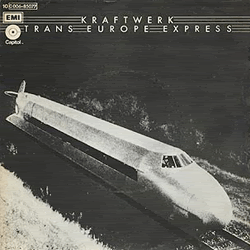
EMI Capitol DE 7" [1977]

Mute/Kling Klang UK & US LP [2009]
No comments:
Post a Comment